Wednesday, 12 December 2012

QuarkXPress


The Dan London album cover is imported into quark so a greater range of text fonts can be used, as well as ease of editing and arranging the text.

Plain text is first added in order to realise the location of the initial text box

Searching for font choice that will suit the font already used during the photoshop creation
The final font choice was chosen as it suited the urban style look used in "Tracks"


Practice digi pack


Using photoshop

Different layers of image are used in order to help limit any mistakes. It also helps in being able to alter  and manipulate the image as each fragment that creates the final product can be individually tailored.

New images are imported into photoshop, adding to the layers that we can manipulate.

The near final product after image manipulation. As you can see images were made black and white using a colour correction tool and the lowering of the images saturation.


Dan London: Near finished album cover

This is my album cover for Dan London's debut album, although not complete, the conventions of a new artists album are followed. Such as the use of the artists face in order to allow consumers to become aware of the artist. 

Research: digipaks and magazines

Do's and Don'ts when constructing the digipaks and magazine adverts.

DO

  • Use appropriate font and images, making sure they are clear to read and the photos are in focus
  • Use a lay our that follows the rule of the thirds for composition
  • Use an appropriate type face that allows genre conventions and a house style
  • Be careful where you place the font -  follow genre conventions and be clear from a distance
  • follow the conventions of the 3 colour rule and use colour that is appropriate for: images, font and background
  • Think carefully about how you use and integrate font, text and language and image
  • Use appropriate industry logos and conventions, properly positioned: barcode, date, copy right, titles  and artist name. 

DON'T


  • Stretch images because it will make them out of focus
  • Use layer styles
  • Use unnecessary effects. Any effects used must be suit the genre
  • Use a font simply because you like it
  • Feel you need a separate photo on every panel. 

Friday, 7 December 2012

Photoshop introduction: Dan London Digipak

We were introduced to photoshop today in order to reproduce a Digipak created by Rebecca, the original that we have to reproduce is below standard quality with many Do's and Don'ts of a successful Digipak broken. 

The Original (Dan London)


Font choice is incorrect. Text is in front of face.
Basic information in song listing missing. Gradient colour change is abysmal.

Inside cover should not be used for a personal thank you.
It is basic and the filters used do not work.

Album cover incorrectly placed. Lack of information on Label.
Lack of information on where to buy the album.
Similar to the others it has  distracting and ugly fonts.

Sunday, 2 December 2012

Gaining An Analytic Eye

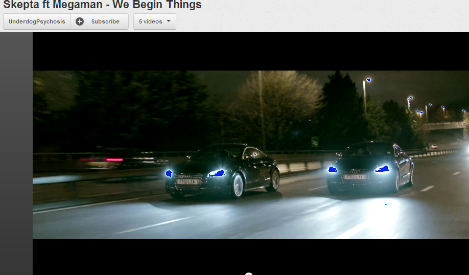
After doing all my research into music video's i am really starting to analyse their camera movement, transition styles and editing skills. When recently watching this rap video i noticed an error in their editing.


As you can see the headlights are blue, this is what happens when u attempt to change the gradient of specific lighting through a colour correction pallet without then finishing it off. I learnt this when i was doing something fairly similar with my cutaway of moving traffic as i attempted to get a more exaggerated look of the car head beams.